 Welcome to “From Richard’s Studio”, a place for Richard and the team to share our design knowledge and ideas. Those trends, styles, and special features that are meaningful and inspire us to create classic and timeless interior designs. We believe good interior design evokes an emotional response. We create these experiences with research, expertise, and inspiration. We hope that our design tips offer inspiration for your home!
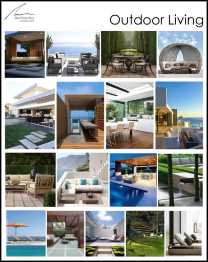
Gacek Design Group – Outdoor Living
Be Inspired with our Pinterest Board!
The outdoor living trend continues to grow in popularity. The American Institute of Architects (AIA) noted in a recent study that outdoor spaces are the most requested special function room. Decks and patios are more elaborate as materials get better. Maintenance free products available in all weather climates allows for state of the art appliances, TVs and lighting; water features, fire bowls, as well as pizza ovens. Today, outdoor living is an extension of the indoor space and essential for family time as well as entertaining.